New navigation and UI changes
In this release we’ve introduced a few UI changes to make the user experience even better for our customers.
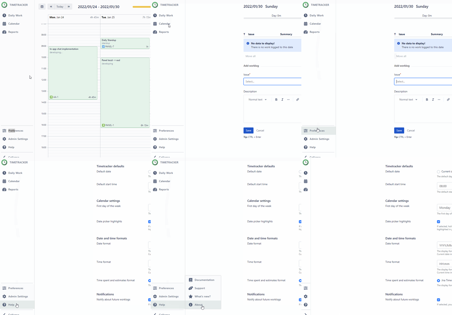
We changed the old navigation to a sidebar to make it even easier for users to find everything and to have more space for the information that really matters to users.

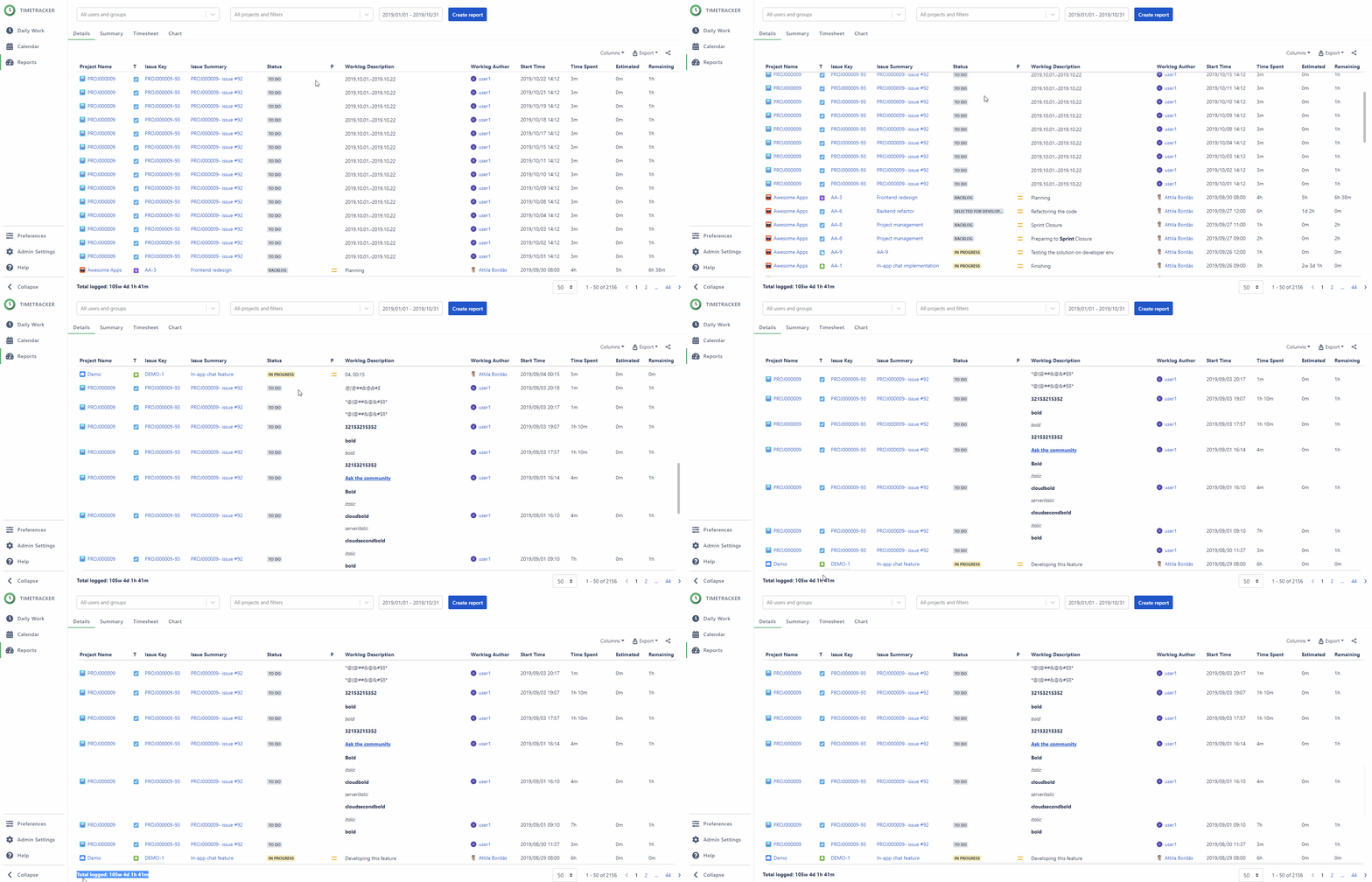
With this new sidebar, we also changed how the reports are displayed. From now on, each report filter and option with the result will be always visible. We also changed the position of the “Total logged” value from the top right side to the bottom left corner.

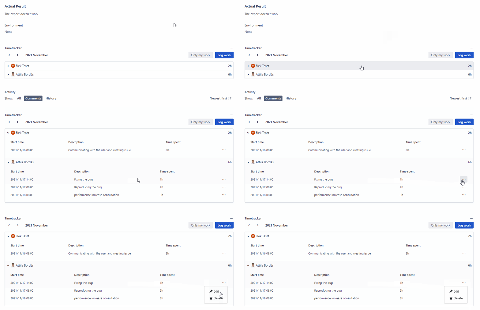
We redesigned the outdated looking Timetracker panel to better fit the current look of Jira Cloud.

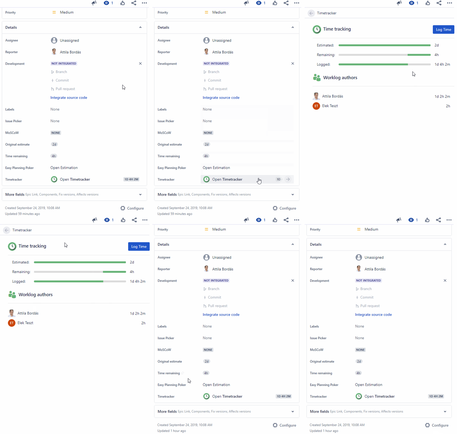
We removed the time tracking fields from the panel, however, we introduced a new Timetracker Issue glance, where you can find these values with a progress bar, just like it was in Jira Server. In this glance, you can also see the total time logged by all users who have ever logged on to the issue.

